Exploring Relationships Between Performance Metrics in HTTP Archive Data
I thought it would be interesting to explore how some of the page metrics we use to analyze web performance compare with each other. In the HTTP Archive “pages” table, metrics such as TTFB, renderStart, VisuallyComplete, onLoad and fullyLoaded are tracked. And recently some of the newer metrics such as Time to Interactive, First Meaningful Paint, First Contentful paint, etc exist in the HAR file tables.
But first, a warning about using response time data from the HTTP Archive
While the accuracy has improved since the change to Chrome based browsers on linux agents – we’re still looking at a single measurement from many sites, all run from a single location and a single browser or mobile device (Moto G4). For this reason, I’m not looking at any specific website’s performance, but rather analyzing the full data-set for patterns and insights.
Note: All queries below use Standard SQL instead of Legacy SQL
Creating Histograms with BigQuery
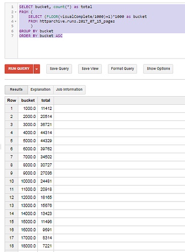
When I started looking at this, I wanted to create a histogram to compare metrics to each other. I started with a query such as the following:
SELECT bucket, count(*) as total
FROM (
     SELECT (FLOOR(visualComplete/1000)+1)*1000 as bucket
     FROM httparchive.runs.2017_07_15_pages
     )
GROUP BY bucket
ORDER BY bucket ASC
And for the metrics that only exist in the HAR files, I was able to use a query like this to extract those results:
CREATE TEMPORARY FUNCTION getHarEntry(payload STRING, field STRING)
RETURNS INT64
LANGUAGE js AS """
  try {
    var $ = JSON.parse(payload);
    return $[field];
  } catch (e) {
    return '';
  }
""";

SELECT bucket, count(*) as total
FROM (
     SELECT (FLOOR(getHarEntry(payload, "_TTIMeasurementEnd")/1000)+1)*1000 as bucket
     FROM httparchive.har.2017_07_15_chrome_pages
     )
GROUP BY bucket
This worked, and produced a histogram output such as:
However, running this for multiple metrics would have required lots of queries and manual post processing work. I decided to collect the output from queries like the ones above in a UNION, add a “metric” column to describe what each query contained, and then summarized all them. The output is similar to what you might expect if you ran each of these queries, dumped them into Excel and created a pivot table. It’s just a lot less manual work…
CREATE TEMPORARY FUNCTION getHarEntry(payload STRING, field STRING)
RETURNS INT64
LANGUAGE js AS """
  try {
    var $ = JSON.parse(payload);
    return $[field];
  } catch (e) {
    return '';
  }
""";

SELECT bucket,
                MAX(IF(Metric = 'renderStart', total, 0)) AS renderStart,
                MAX(IF(Metric = 'domInteractive', total, 0)) AS domInteractive,
                MAX(IF(Metric = 'firstPaint', total, 0)) AS firstPaint,
                MAX(IF(Metric = 'firstMeaningfulPaint', total, 0)) AS firstMeaningfulPaint,
                MAX(IF(Metric = 'visualComplete', total, 0)) AS visualComplete,
                MAX(IF(Metric = 'onLoad', total, 0)) AS onLoad,
                MAX(IF(Metric = 'fullyLoaded', total, 0)) AS fullyLoaded,
        MAX(IF(Metric = 'TTIMeasurementEnd', total, 0)) AS TTIMeasurementEnd

FROM (


    SELECT "renderStart" as Metric, bucket, count(*) as total
    FROM (SELECT (FLOOR(renderStart/1000)+1) as bucket FROM httparchive.runs.2017_07_15_pages)
    GROUP BY Metric, bucket

    UNION ALL

    SELECT "firstPaint" as Metric, bucket, count(*) as total
    FROM (SELECT (FLOOR(getHarEntry(payload, "_firstPaint")/1000)+1) as bucket FROM httparchive.har.2017_07_15_chrome_pages)
    GROUP BY Metric, bucket

    UNION ALL

  SELECT "firstMeaningfulPaint" as Metric, bucket, count(*) as total
    FROM (SELECT (FLOOR(getHarEntry(payload, "_chromeUserTiming.firstMeaningfulPaint")/1000)+1) as bucket FROM httparchive.har.2017_07_15_chrome_pages)
    GROUP BY Metric, bucket

    UNION ALL

    SELECT "domInteractive" as Metric, bucket, count(*) as total
    FROM (SELECT (FLOOR(getHarEntry(payload, "_domInteractive")/1000)+1) as bucket FROM httparchive.har.2017_07_15_chrome_pages)
    GROUP BY Metric, bucket

    UNION ALL

    SELECT "visualComplete" as Metric, bucket, count(*) as total
    FROM (SELECT (FLOOR(visualComplete/1000)+1) as bucket FROM httparchive.runs.2017_07_15_pages)
    GROUP BY Metric, bucket

    UNION ALL

    SELECT "onLoad" as Metric, bucket, count(*) as total
    FROM (SELECT (FLOOR(onLoad/1000)+1) as bucket FROM httparchive.runs.2017_07_15_pages)
    GROUP BY Metric, bucket

    UNION ALL

    SELECT "fullyLoaded" as Metric, bucket, count(*) as total
    FROM (SELECT (FLOOR(fullyLoaded/1000)+1) as bucket FROM httparchive.runs.2017_07_15_pages)
    GROUP BY Metric, bucket

    UNION ALL

    SELECT "TTIMeasurementEnd" as Metric, bucket, count(*) as total
    FROM (SELECT (FLOOR(getHarEntry(payload, "_TTIMeasurementEnd")/1000)+1) as bucket FROM httparchive.har.2017_07_15_chrome_pages)
    GROUP BY Metric, bucket
)
WHERE bucket IS NOT null AND bucket < 30000
GROUP BY bucket
ORDER BY bucket ASC
When we graph this data, it looks like this:
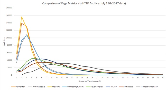
Based on this data there are some interesting observations (which we’ll test below to prove/disprove)
- The Render Start metric appears to track close to First Paint, but slightly slower
- The DOM Interactive metric appears to track very close to First Meaningful Paint.
- The Visually Complete metric appears to track slightly faster than the onload metric.
- The Time to Interactive metric appears to track close to the Fully Loaded metric, but is slightly slower.
Graph’s Don’t Lie, Or Do They?
So now we have a few observations – but keep in mind that we are comparing histograms to each other and not individual sites’ performance. This allows us to observe some interesting patterns and it is tempting to draw conclusions, but it is important to validate the assumptions. For example, how likely is it that a particular site is going to have a First Paint time that tracks very close to Render Start, a Visually Complete time close to onLoad, a Time To Interactive that is etc?
In order to determine this, I decided to modify the above query to create histograms of the % difference between pairs of metrics we analyzed above for each site. The following query will be used to validate each of the 4 bullet points above. Note that I trimmed the data to look at only +/- 100% difference.
CREATE TEMPORARY FUNCTION getHarEntry(payload STRING, field STRING)
RETURNS INT64
LANGUAGE js AS """
  try {
    var $ = JSON.parse(payload);
    return $[field];
  } catch (e) {
    return '';
  }
""";

SELECT bucket,
            MAX(IF(Metric = 'Render_FirstPaint_Diff', total, 0)) AS Render_FirstPaint_Diff,
            MAX(IF(Metric = 'FirstMeaningfulPaint_DOMInteractive_Diff', total, 0)) AS FirstMeaningfulPaint_DOMInteractive_Diff,
      MAX(IF(Metric = 'VisualComplete_onLoad_Diff', total, 0)) AS VisualComplete_onLoad_Diff,
      MAX(IF(Metric = 'FullyLoaded_TTI_Diff', total, 0)) AS FullyLoaded_TTI_Diff

FROM (
    SELECT "Render_FirstPaint_Diff" as Metric, bucket, count(*) as total
    FROM (
    SELECT FLOOR((renderStart - getHarEntry(payload, "_firstPaint")) / renderStart * 100) /  100 AS bucket
    FROM httparchive.har.2017_07_15_chrome_pages har INNER JOIN httparchive.runs.2017_07_15_pages  p ON har.url = p.url
    WHERE renderStart > 0
    )
    GROUP BY Metric, bucket

    UNION ALL

    SELECT "FirstMeaningfulPaint_DOMInteractive_Diff" as Metric, bucket, count(*) as total
    FROM (
    SELECT FLOOR((getHarEntry(payload, "_domInteractive")-getHarEntry(payload, "_chromeUserTiming.firstMeaningfulPaint")) / getHarEntry(payload, "_domInteractive") * 100) /  100 AS bucket
    FROM httparchive.har.2017_07_15_chrome_pages
    WHERE getHarEntry(payload, "_domInteractive") > 0
    )
    GROUP BY Metric, bucket

  UNION ALL

  SELECT "VisualComplete_onLoad_Diff" as Metric, bucket, count(*) as total
    FROM (
    SELECT FLOOR((onload - visualComplete) / onload * 100) /  100 AS bucket
    FROM  httparchive.runs.2017_07_15_pages
    WHERE onload > 0
    )
    GROUP BY Metric, bucket

  UNION ALL

  SELECT "FullyLoaded_TTI_Diff" as Metric, bucket, count(*) as total
    FROM (
    SELECT FLOOR((getHarEntry(payload, "_TTIMeasurementEnd") - fullyLoaded) /  getHarEntry(payload, "_TTIMeasurementEnd") * 100) /  100 AS bucket
    FROM httparchive.har.2017_07_15_chrome_pages har INNER JOIN httparchive.runs.2017_07_15_pages  p ON har.url = p.url
    WHERE getHarEntry(payload, "_TTIMeasurementEnd") > 0
    )
    GROUP BY Metric, bucket

)

WHERE bucket IS NOT null  AND bucket >= -1 AND bucket <= 1
GROUP BY bucket
ORDER BY bucket ASC
I created a histogram for each test case below –
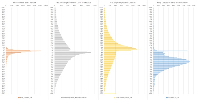
The results are quite interesting. What we can tell here is:
- Unsurprisingly, render time and first paint time appear to be very closely related. Almost 82% of pages had a StartRender time that was within 10% of the First Paint Time, and StartRender came after First Paint for more than 99% of these pages…
- First Meaningful Paint and DOM Interactive are not as closely related as the first graph would have led us to believe. However there are around 29% of sites where these measurements appear within 10% of each other.
- Visually Complete and onLoad are also not closely related either, except for ~32% of sites that fall within 10% of each other…
- There is a strong correlation between Fully Loaded and Time to Interactive. 13% of the sites measured have a TTI within 10% of Fully Loaded time. 73% of sites had a TTI that ranged from 15% to 45% slower than the Fully Loaded Time
What About Mobile?
These metrics can be extracted from the mobile pages in the HTTP Archive as well. The same patterns exist, albeit with slower response times.
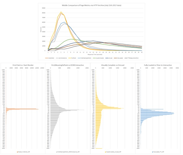
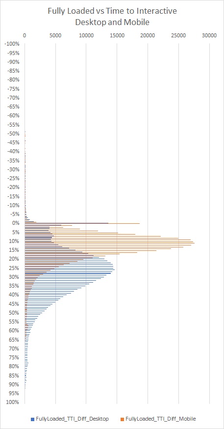
However if you look closely at the Time to Interactive vs Fully Loaded graphs on Desktop and Mobile,you’ll see that the gap is smaller for mobile. I thought this was particularly interesting – and you can see it clearly in the graph below –
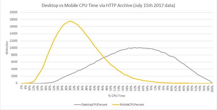
Since we know that the Time to Interactive metric is related to CPU utilization, I thought it would be interesting to take another look at the breakdown of CPU time on Desktop vs Mobile pages. The following query will create histograms that show us this information using the same techniques discussed above:
CREATE TEMPORARY FUNCTION getHarEntry(payload STRING, field STRING)
RETURNS INT64
LANGUAGE js AS """
  try {
    var $ = JSON.parse(payload);
    return $[field];
  } catch (e) {
    return '';
  }
""";

SELECT bucket,
                MAX(IF(Metric = 'DesktopCPUPercent', total, 0)) AS DesktopCPUPercent,
                MAX(IF(Metric = 'MobileCPUPercent', total, 0)) AS MobileCPUPercent


FROM (

    SELECT "DesktopCPUPercent" as Metric, bucket, count(*) as total
    FROM (SELECT  FLOOR(getHarEntry(payload, "_fullyLoadedCPUpct")) as bucket FROM httparchive.har.2017_07_15_chrome_pages)
    GROUP BY Metric, bucket

    UNION ALL

    SELECT "MobileCPUPercent" as Metric, bucket, count(*) as total
    FROM (SELECT FLOOR(getHarEntry(payload, "_fullyLoadedCPUpct")) as bucket FROM httparchive.har.2017_07_15_android_pages)
    GROUP BY Metric, bucket

)
WHERE bucket IS NOT null AND bucket < 101
GROUP BY bucket
ORDER BY bucket ASC
The results of this query show that overall, CPU busy time is much higher on Desktop compared to Mobile. This seems to contradict what many of us see every day with mobile performance on websites though – so I wonder if it could be a result of mobile CPU emulation.
There’s definitely some interesting insights to be obtained from digging into the metrics across so many different sites, and I hope that others find this as interesting as I did!
Originally published at https://discuss.httparchive.org/t/exploring-relationships-between-performance-metrics-in-http-archive-data/1067