Performance and Usage Implications of Custom Fonts

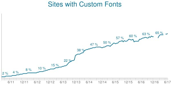
You may not think about it much, but fonts play a critical role in how quickly a web page renders. Custom font usage has increased steadily over the past six years, and as of this writing, 68% of sites in the HTTP Archive use at least one custom font.
Why use custom fonts? Many companies use a custom font for branding, to exercise control and familiarity with their brand. However, custom fonts come with a performance cost, as they often delay the rendering of text until the font is downloaded.
Unlike some third-party content, which can be delayed without the user noticing, fonts need to be prioritized and loaded quickly to ensure an optimal user experience. There are a few performance techniques to get web fonts to load fast, but before delving into that you might simply ask the question of whether a custom font is actually worth the performance cost, based on how it is used on a page.
I’ve found that it has been difficult to evaluate this because the information on where a font is used in the page isn’t easily accessible in the DOM. Since I hadn’t been able to find any tools to analyze a font’s usage on a page, I decided to start writing a tool to help fill this gap. I’ll show you how to use it below.
Before I get to that, I want explain how fonts are loaded, what their rendering impact is, how browsers are adapting to this challenge, and how you can improve performance. Web Font Loading Overview
First, let’s explore how fonts make it onto web pages. One of the most common ways to load web fonts on a page is to include a CSS @font-face style with a src attribute for a font file. Since there are many different font formats, it’s common to include multiple font files, each with different formats in the CSS rule.
Web Font Loading Overview
First, let’s explore how fonts make it onto web pages. One of the most common ways to load web fonts on a page is to include a CSS @font-face style with a src attribute for a font file. Since there are many different font formats, it’s common to include multiple font files, each with different formats in the CSS rule.
I won’t go too deep into all the font-load strategies, but if you’re interested in a comprehensive overview, you may want to read this excellent article: A Comprehensive Guide to Font Loading Strategies.
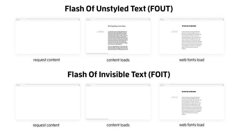
Each browser has a different method of dealing with web fonts, and some of them have evolved their strategies over time due to both performance and perceived user experience. You may have seen some acronyms like FOUT and FOIT when describing font rendering. Let’s explore what these are:
- Flash of Unstyled Text (FOUT) was the old default in Chrome and Firefox. Basically, text would display very quickly and then once the web fonts loaded the page would flash as browser restyled all of the fonts. This flash of unstyled text was a very noticeable usability issue and was considered undesirable.
- Flash of Invisible Text (FOIT) was the answer to the usability problem that FOUT caused, but it introduced a delay in rendering. Instead of rendering content immediately, the styled content is invisible until the font is loaded. This is why sometimes you’ll see first paint trigger way before StartRender on a page load time; some invisible content was painted to the screen, waiting for a font to load so that it can be rendered.
To put it into perspective, this excellent presentation from Bram Stein illustrates the difference clearly
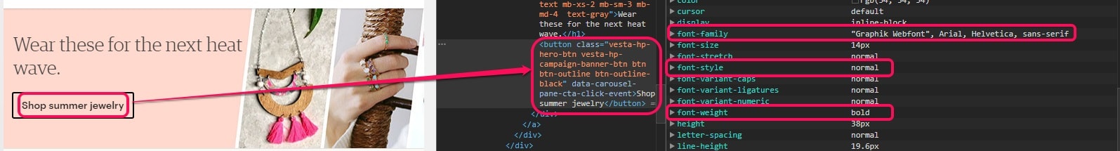
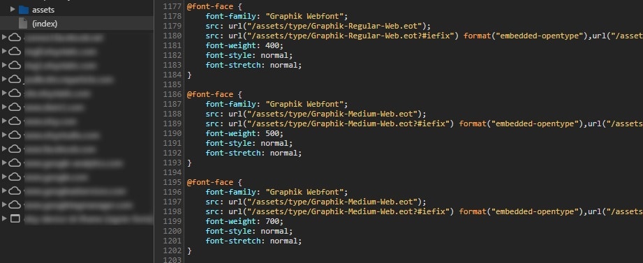
When a DOM element is styled, typically it uses “font stacks”. The idea behind a font stack is to specify multiple fonts that can be used to style the element, and the order in which they are preferred. For example, in this page, you can see that the text “Shop summer jewelry” has a font stack that includes a custom web font named “Graphik Webfont” as well as the “web safe fonts” Arial, Helvetica and sans-serif. The style also includes a normal font style and a bold font weight.
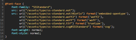
That element is styled in the following CSS. And since the Graphik Webfont is a custom web font, we need a CSS rule telling us about that font.

Earlier in that CSS file I can see three @font-face elements, describing the Graphik Webfont. Why three elements instead of one? Notice the font weights: 400, 500 and 700? The CSS2 specification defines a 400 font weight as “normal”, a 500 weight as “medium” and a 700 weight as “bold”.
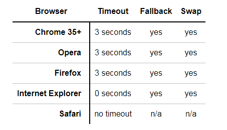
So what happens if a browser fails to load a font? That’s what the fallback fonts are for. When a font fails to load before a timeout occurs, a browser will display text with one of the fallback fonts (which are generally included in the operating system), and then swap the font out once the intended font becomes available. This essentially will look like a FOUT (flash of unstyled text), but it would only occur with a very long timeout of three seconds for Chrome, Opera and Firefox browsers.
The answer to this problem has been the CSS Font-Rendering Controls proposal, which was introduced in 2015. You can read about it here: CSS Font Rendering Controls Module Level 1. This will add a new @font-face descriptor named ‘font-display’ that will specify how a font is displayed, based on whether and when it’s downloaded and ready to use. For example:
| font-display value | Behavior |
|---|---|
| auto | Allow the browser to use it’s default font-display strategy |
| block | Give the font face a short block period, and an infinite swap period.,This means a very short (100ms) flash of invisible text (FOIT) followed by a flash of unstyled text (FOUT) once the font loads. |
| fallback | Gives the font face a very short (100ms) block period and a short (3s) swap period. This means that the font will be rendered with the fallback if it’s not loaded within 100ms, and then the flash of unstyled text will only occur if the font loads within 3s. |
| optional | Gives the font face a very short (100ms) block period and a 0s swap period.,This means that the font will be rendered with the fallback if it’s not loaded within 100ms, and it won’t swap in if loaded later. |
| swap | Give the font face a 0s block period and an infinite swap period.,This is basically a flash of unstyled text (FOUT). |
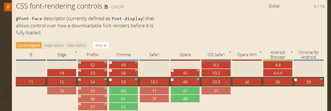
The CSS font-display behavior sounds really awesome, and it will give developers more control over the font loading behaviors. However it’s still very new and not widely supported yet. It will be supported in Chrome 60 and Opera 47, which means September 2017. It’s in development in Firefox as well, and can be enabled for testing with a flag in about:config. Expect to hear more about this in the future… http://caniuse.com/#search=font-display
Understanding Font Loading Performance
On most browsers a web font is only downloaded when it is used in a CSS selector that matches a DOM connected node (a notable exception is IE). That means that once the DOM knows it needs a font, it starts downloading it. And that can result in render time latency since a lot can happen during a page load before then.
Let’s look at this in more detail. In the example below you can see that the CSS containing the @font-face rules loaded very quickly, but there was a 1.2 second gap until the first font was loaded. There was also a 0.5 second gap between the when the initial paint (flash of invisible text) occurred and the page started rendering.
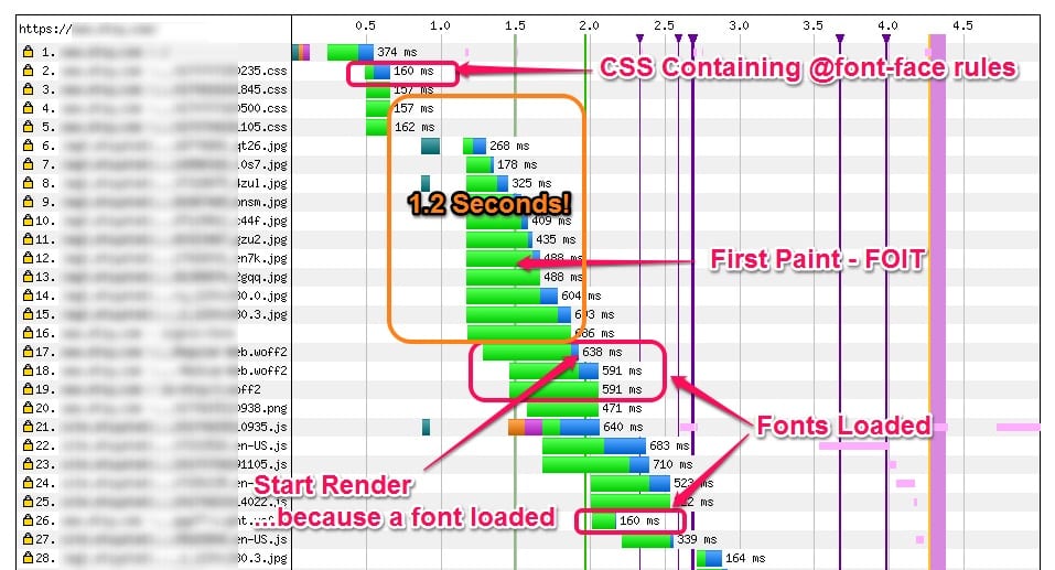
Let’s look a bit deeper at those first two seconds. You can see that the HTML
was parsed first, and that’s where our CSS rule was loaded. There were some more stylesheets and some image requests before the browser was done parsing the . Then the browser parsed the HTML , recalculated styles and built the DOM. And then the web fonts were requested. While the font was being requested, the raster thread painted something to the screen – but it was invisible until the font loaded.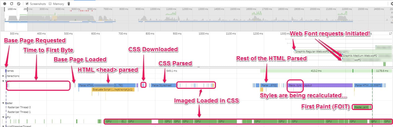 </p>
</p>Optimizing Font Loading Performance
If we can anticipate a font being loaded then that network request can be done up front. There are some solutions that can be used to address this problem. As with most performance optimizations, it’s not a one-size fits all. These are a bunch of possible optimizations that depending on the site may help with font loading performance:
- Preloading fonts with a crossorigin attribute can get the network request started earlier.
- H2 Server Push can get the browser to load the fonts early, although the cross-origin nature of them can be problematic.
- Using the Font Loading API to load the fonts via JavaScript where supported.
- Selectively loading custom fonts based on screen width.
- Load fonts on Primary Domain when possible to minimize protocol overhead (don’t use third-party fonts, or use a domain shard to load fonts).
- Use preconnect for third-party fonts (get a head start on the protocol overhead so it doesn’t delay the font loading).
There’s a ton of other useful information on font loading strategies for performance here if you want to read more:
- A Comprehensive Guide to Font Loading Strategies | zachleat.com
- Preventing the Performance Hit from Custom Fonts | CSS-Tricks
- Webfont performance notes | GitHub
- Web Fonts Performance | Speaker Deck
How to Determine Whether a Font is Being Used on a Page
So that brings us to determining where fonts are being used on a rendered page. One of the biggest issues with font loading is overuse of fonts, or using a font for a very small obscure part of the screen. And because of how the font stacks are disassociated from the @font-face URLs, it’s not easy to see how fonts are being used.
I recently created a tool that highlights font usage on a page. The tool is currently located on Github at webfont-usage-analyzer. The tool currently only works on Chromium-based browsers and highlights parts of the page where specific web fonts are used. It can be used by pasting JavaScript into the DevTools JS Console or by creating a bookmarklet.
The tool gives us the ability to look at a page and see where a specific font stack is used. For example, I can easily highlight where a bold font is used on a demo site

Or I can use it on another site to see that a custom web font was used to style a very small piece of text. For something like this, it might make more sense to use a web safe font instead.
Note: The tool only works where CORS headers allow, so some sites will not allow the current page to access this information on resources loaded from external domains due to the same-origin policy. (See Same-origin Policy on Anne’s Blog.)
So How Do I Use This Tool?
- Navigate to the web page that you want to examine fonts for.
- Open up Chrome Dev Tools.
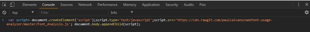
- In the JS Console, paste the following JavaScript code.
var script= document.createElement('script');script.type='text/javascript';script.src='https://cdn.rawgit.com/paulcalvano/webfont-usage-analyzer/master/Font_Analysis.js'; document.body.appendChild(script); - If prompted to rerun the script, then do it a second time. This is to ensure that all scripts we attempted to request a second time are parsed.
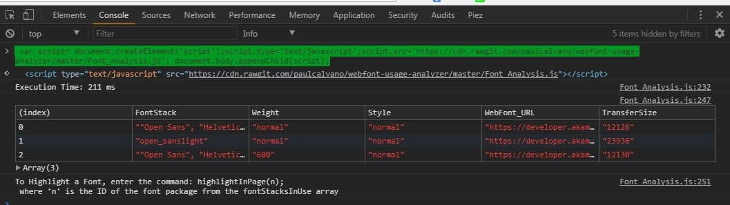
- Once the script is done executing, you should see a table like the one below. TransferSize will only be included if allowed.
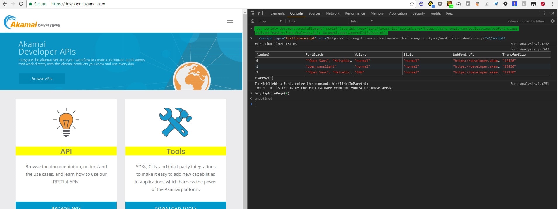
- Enter the command highlightInPage(n) where n is the index from the table displayed in your console. For example, when I ran highlightInPage(2) for the Akamai Developer homepage I can see where we are using a 600 weight Open Sans font.
Conclusion
I may add some more features to this tool, but I wanted to share what I have so far. In the meantime, feel free to use it and let me know if you have any feedback or suggestions on how to improve it.